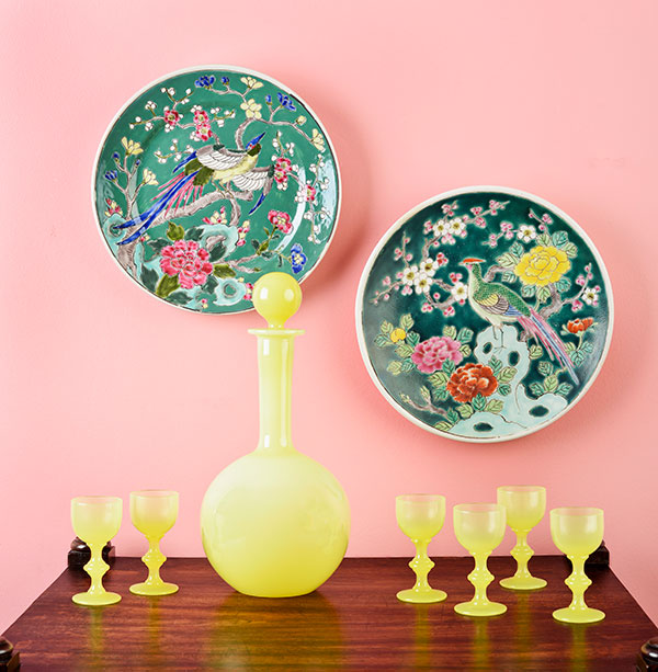
I think it's ugly. Is it the Pepto-Bismol wall color, or the hideous burnt umber tones in the wood? Either way, this composition did not start out ugly. Under the studio lights, it looked really pretty. The rods and cones of my retina told my brain that the colors complemented each other. I believed my brain and patted myself on the back for assembling a visual lovefest of vivid pastels.
But a camera lens is not an eyeball and through my photographer's camera lens, the pink wall went from a soft blush to something more like salmon. The antique tea table, which is a rich brown, turned burnt orange. And through the camera lens, I saw that the sleek decanter and cordial glasses didn't suit the polychrome plates.
Read more
