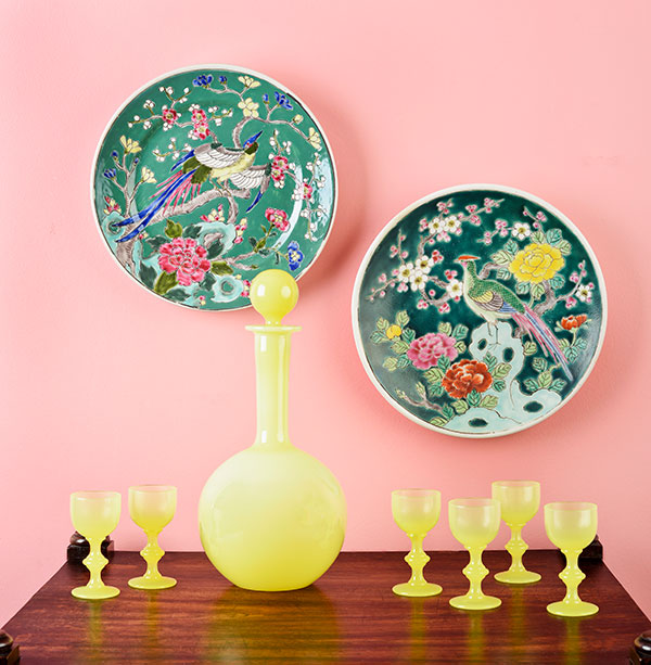
I think it's ugly. Is it the Pepto-Bismol wall color, or the hideous burnt umber tones in the wood? In this post, you'll see three different ways I shot this decanter.
Number One: Pink Wall
This composition did not start out ugly. Under the studio lights, it looked really pretty. The rods and cones of my retina told my brain that the colors complemented each other. I believed my brain and patted myself on the back for assembling a visual lovefest of vivid pastels.
But a camera lens is not an eyeball and through my photographer's camera lens, the pink wall went from a soft blush to something more like salmon. The antique tea table, which is a rich brown, turned burnt orange. And through the camera lens, I saw that the sleek decanter and cordial glasses didn't suit the polychrome plates.
Glancing at the image now, the words "garish" and "screaming" come to mind. So, Renn and I went back to the drawing board.
Number Two: Light Box
Shooting in a light box is a way to show an object's true DNA. Not much can hide under these lights. You can see the brave curves of the handblown glass. The citron is translucent. Not a bad option but because the surface of the glass is so reflective, the image gets a little over-exposed. Hard to correct without effecting the actual color.
Number Three: Taupe and Black
Not too bad, but again, a little over-exposed. This photo has another problem. You can see the reflection of my dining room windows. Using Photoshop, I was able to soften that effect on the side of the decanter, but couldn't do it in the cordial glasses. Actually, I could, but by now, I'm sick to death of this stupid decanter.
And none of these photos convey the feel of this glassware. First of all, it's French. Which might explain my love for it, despite it getting on my nerves. I like its modern shape, and that color! My bedroom in the 1970s was the same color and everyone thought my mom was super hip for picking it.
So to help me decipher the best way to shoot the decanter, which incidentally is named Philippe, I created a "mood board", below. It's like a visual bulletin board of images from Philippe's life before we met -- his first girlfriend, his shower curtain, his first apartment, his second girlfriend and her car, etc. Silly? Yes, but it helps! I think I have a plan. Philippe and I will be in the studio (my basement) this weekend, and we're not coming up for air until his sleek shiny lemony self is properly appreciated by my eyeballs and Nikon's too.
Photos of decanter by Renn Kuhnen and Mithra Ballesteros.
P.S. If I have you all hot and bothered for something lemony and fun that is actually for sale, here's something I just listed in the shop last night.


